Three services, three sectors. One conversation.
Peta Grant works under the name Peta the Networking Queen, connecting Perth founders, owners and brands through introductions, ambassadorship and the rooms she hosts. When the product is a person, the website is not a brochure — it is the thing a stranger checks before they reply.
- Case study
- Personal brand
- Perth, WA
- Live
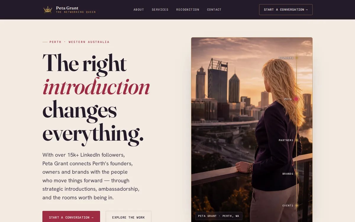
A site that survives being checked.
Most visitors arrive already knowing the name — from LinkedIn, from an event, from somebody's introduction — and they're there to confirm it's real before they answer an email. So the web design brief was confidence at a glance: a first screen that states the offer, and evidence within one scroll of it.
That argued for one page rather than several. A person is one story, and splitting it across tabs makes a reader hunt for the part that reassures them. Everything in the header points further down the same page.
One page, six moves.
The claim, then the receipts
A one-line hero — the right introduction changes everything — and immediately under it a strip naming the recognition, the current role and the years behind it. On a personal brand the credentials can't wait until an about section.
Three services, named plainly
Business connecting, ambassadorship, networking. Three things a stranger can point at and say "that one", instead of one paragraph about relationships.
The about section, written as a person
Not a CV. Where she is based, what she is known for, and what she does with it now — the part that makes an introduction feel like a favour rather than a transaction.
Three sectors, so the network is specific
Sustainability, artificial intelligence, telecommunications. "I know everyone" persuades nobody; "I know these three rooms" is the sentence that gets an email.
The proof, attributed
Recognition, a magazine feature, and testimonials that say in a line above them exactly where they came from. See the note below — this was the design decision on the page.
One form, four fields
Name, email, company (optional), and what you would like to explore. The last field is the whole site: it asks for the introduction rather than the enquiry.
- Sector — business networking
- One page
- 15K+ LinkedIn audience
- Status — live
Say whose testimonials they are.
The strongest written proof available came from the Practice Capital team's client work, not from her own networking clients. The easy build drops those quotes into a testimonial slider and lets the reader assume. The page instead carries a line, directly above them, saying exactly who wrote them.
It costs a sentence and it is worth it. Borrowed proof presented as your own only works on people who do not check — and in a business built on introductions, the ones worth winning always check.
Proof you can attribute beats proof you can't.
A personal brand changes faster than a service list — a new role, a new recognition, a new room. That is what ongoing care is for, on top of hosting that keeps the page quick when the link goes out to a network that size.
Is the business basically you?
Tell us what you want to be known for and who you want to hear from. The build is quoted up front, and running it starts from $9.95 a week.