Seven pages. And the paintings lead every one.
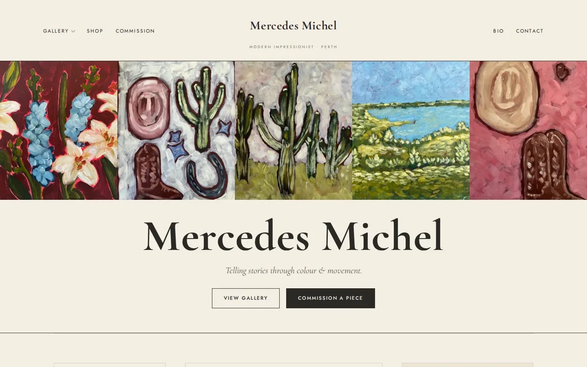
Mercedes Michel is a modern impressionist painter in Perth, Western Australia, selling original work and taking commissions under the name Mercedes Michel Studio. An artist's website has a harder job than a service site: the work has to be the argument, and every layout decision either helps it or gets in its way.
- Case study
- Artist portfolio
- Perth, WA
- Live
Get out of the way of the colour.
These are saturated, energetic paintings. Put them on a busy page and they fight it. So the web design decision was a quiet canvas — restrained type, wide margins, almost no colour that isn't a painting — and then to let the work run edge to edge wherever there was room for it.
The second half of the brief was commercial, not aesthetic. Originals sell one at a time and prints were not ready yet, so the site had to convert admiration into an enquiry without a checkout — which is a structure problem, not a shop-plugin problem.
Seven pages, one job each.
A portfolio is not one long scroll. Someone arriving from a market stall wants the gallery, someone arriving from Instagram wants the bio, and someone with a wall to fill wants the commission page. Each got its own address so each can be linked, shared and found on its own.
Home
A single line — "telling stories through colour & movement" — then straight into work. Two buttons only: view the gallery, or commission a piece.
Gallery
The full portfolio across florals, landscapes, western and desert series. Originals sell as they are painted, so the page says so rather than pretending to be stock.
The Eden Collection
A featured series gets its own page. Bold, blooming florals, their own hero, and a commission path in the artist's own style at the end of it.
Shop
A holding page that says the shop is almost here, names what will be in it, and offers the enquiry path in the meantime. Better than a store with nothing in it.
Commission
The four steps — hello, concept and quote, painting, delivery — then a form asking for subject and idea. The page that turns admiration into a brief.
Bio
Where the artist actually talks: Port Hedland, years of painting privately, the decision to show the work. The reason someone buys an original rather than a print.
Contact
Email, the studio's city, a published reply time, and a short form. Nothing between a question and asking it.
A studio mailing list sits in the footer of all seven pages, so a visitor who is not ready to buy still leaves something behind. And the print launch is handled with a waitlist on the home page rather than a countdown — when there is nothing to sell yet, the honest version converts better than the urgent one.
- Sector — fine art
- 7 pages
- Gallery + commissions
- Status — live
The work is the hero. Everything else is scaffolding.
Scaffolding still has to hold. Large images need hosting that serves them fast, and a gallery that changes with every finished painting needs ongoing care rather than a rebuild.
Selling something people have to see first?
Tell us what you make and who buys it. The build is quoted up front, and running it starts from $9.95 a week.